With GenAI emerging as a potential solution, the opportunity was clear. But early testing revealed an unexpected barrier: users didn't know how to write prompts. GenAI felt unfamiliar and uncertain, and a blank prompt box created anxiety rather than possibility. The real design challenge wasn't the AI, it was the moment of first contact.
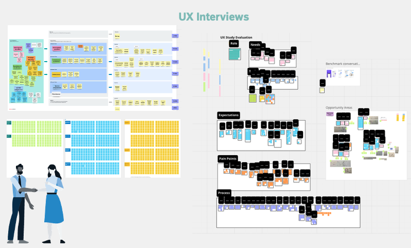 We interviewed 12 marketers and content editors across Bosch business units, using Next AI to accelerate synthesis and pattern identification. We used Next AI to accelerate the analysis of interview research.
Two personas emerged: a Marketing Manager coordinating regional content, and a Regional Marketing Manager localising for local markets. Both were juggling fragmented tools and costly agency dependencies.
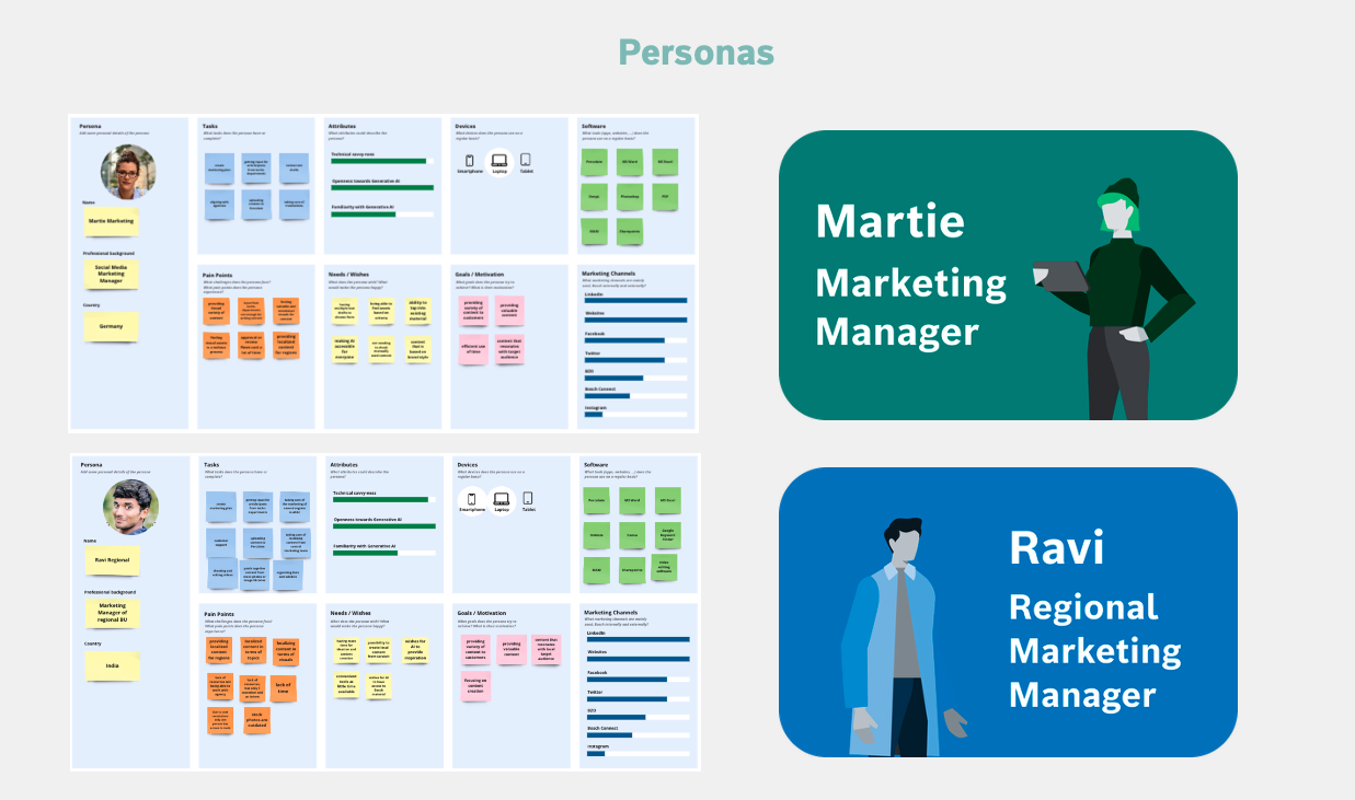 Key insights:
- Consistent, on-brand content across regions was the core need
- Translation and localisation were the biggest pain points
- Users wanted to save time and money — but didn't want to learn prompt engineering to do it
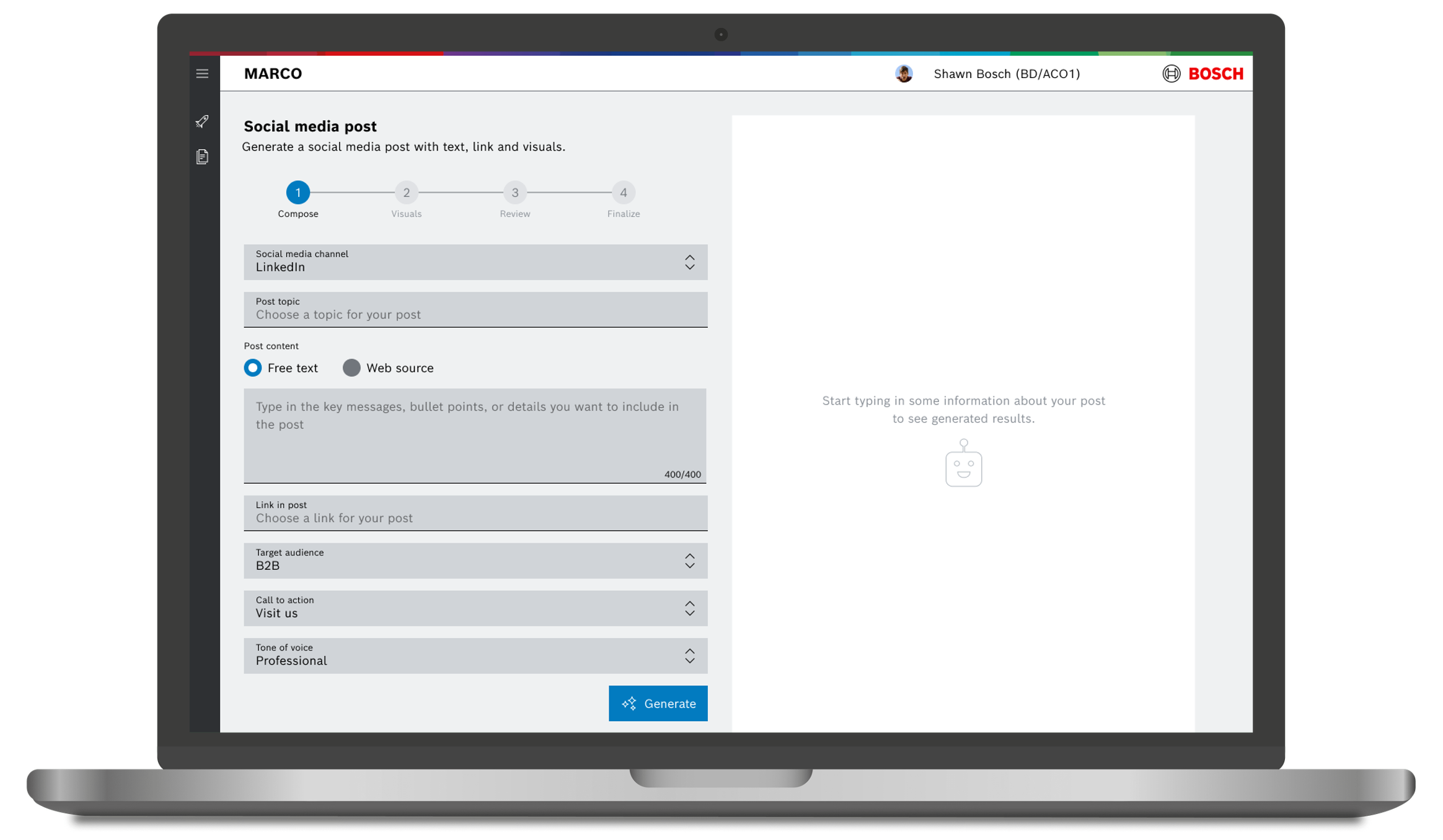
The form asked users what they already knew: platform, audience, message, tone. Those inputs were converted into a prompt behind the scenes. Users never had to write a single prompt.
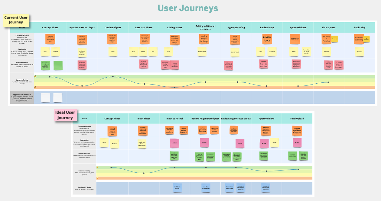
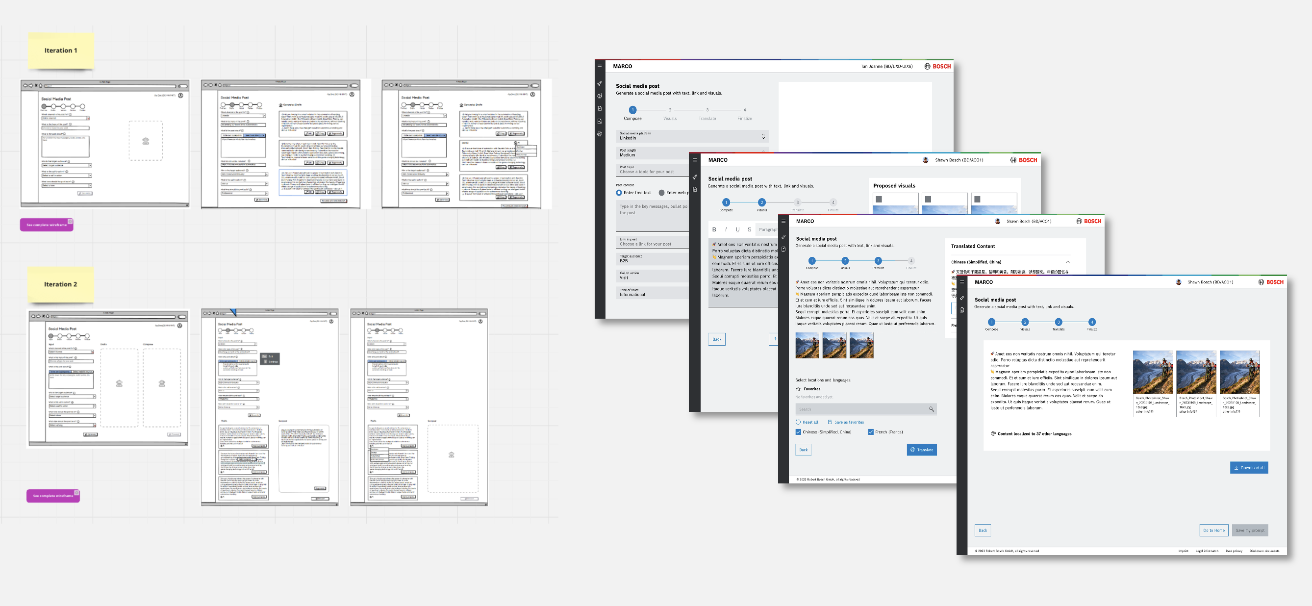
This became the 4-step flow: Compose → Visuals → Translate → Finalise — each step using progressive disclosure to keep complexity out of sight until relevant. A few iteration rounds moved the design from wireframes to working prototype, incorporating stakeholder and user feedback throughout.
Trade off
This approach reduced flexibility for power users, but dramatically lowered the barrier for the majority, which was the right call at this stage of adoption.
 MARCO launched as an internal pilot, successfully validating the form-based GenAI approach. As an innovation project, it was subsequently merged into a broader product initiative, a common path for early-stage concepts that prove their value.
The design and research provided a strong foundation for the next team to build on.
💭 Reflection
The hardest part of designing AI products isn't the AI — it's the first three seconds.
Users weren't resistant to GenAI. They were resistant to uncertainty. Replacing the blank prompt with a familiar form wasn't dumbing it down, it was meeting users where they actually were. The form gave them confidence. The confidence gave them results. The results built trust.
That shift from anxiety to agency, is what good AI UX looks like in its earliest phase.